5 Simply Brilliant Landing Page Examples From Around the Web


The inter-web is a busy, competitive place, and certainly one where poor design and naff, annoying messages are punished by the ultimate judge of all. The User.
Getting your content noticed within Google in the first instance is the difficultly straight off the bat. But let's say - for this blog's sake if nothing else - that you have nailed your Search Engine Optimisation.
Your meta tags, image tags, H1/ H2 headings and structure are all a gorgeous example of SEO to digital marketers the world over. Hurrah! Your site appears on the first page of Google results. Leads, customers and riches are surely coming your way... Nope, not yet.
Sure ranking highly in Google is a MASSIVE step towards improving your business prospects, but it is still merely the first towards turning potential searchers into potential customers. Having engaging, beautiful landing pages for your users is crucial in getting them to input the information you need to begin turning them into crucial fee-paying customers. This is all part of what us marketers call a good inbound marketing strategy.
So what are landing pages I hear you cry? (I can't, obviously. This is a blog).
Landing Pages, simply, are any page that a user first visits on your site. Or - quoting Google - "a web page which serves as the entry point for a website or a particular section of a website."
This is the first port-of-call for users. The first chance to engage with your customers. This is the first impression. And we all know - from the second date you never got - that first impressions matter and are remembered.
Getting your landing pages right is a tricky old business, and there are good examples out there. But do you have the time to look for them? Didn't think so. Luckily I'm on hand to search the vast expanse of web-space to find 5 Simply Brilliant Landing Pages so that you have the best possibly inspiration when next designing your own brilliant landing page!
1. Laithwaites Wines
An eye catching bold Call-To-Action is important for any key eCommerce site and lets be honest here, you want people to buy your products. What better way to do this than by offering a killer, knock-out blow deal?
Laithwaites Wines offer mass wins at affordable prices. However, as I'm sure we're all aware the market for online wine merchants is competitive as any right now. Getting people to invest time and money into their service is naturally the main objective for Laithwaites.
The offer is central to the entire page and cannot be missed. Its massive and immediately grabs the attention of the user. Cleverly, to ensure their credibility is illustrated, two nealty placed 'guarantees' let the user know that 'You're in Good Company' and this is the merchant for them.
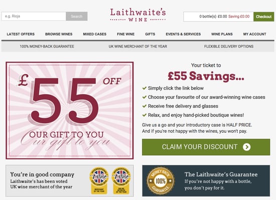
This pages screams that this company, offer and site is something not to be missed and an accessible CTA feeds the users deeper into the site. Now then...where's my wallet?
2. Tailor4less
We are always busy all of the time. So how do you find the time to ensure your new tailored suits is exactly right? Well naturally there's a site for that. Tailor4less (T4L) offers the practicality of online shopping with the exclusive perfected fitted nature that only a tailored suit can offer.
Although again an e-commerce solution, T4L tackle the issue of converting leads very differently. This time there are no offers or complicated pitches. Simplicity is key. You know you are on the site for speed and quality, and T4L clearly knows it too.
You can immediately see the next stage your journey and no time is wasted in directing you towards why you are here. I clean, attractive image says 'this is what we offer now lets go!'.
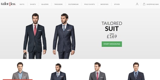
Interestingly there is a secondary element at play here. T4L use the promise of an interactive CTA experience compelling and although this approach requires a little more technical overhead than a static landing page, engagement and conversion rates are very likely to be higher.
3. Last Days of Ivory
Truly brilliant landing pages must make the user think that the only realistic thing they should do next is click the CTA. The Last Days of Ivory does exactly what it suggests.
Fighting back against the ivory trade in Africa and specifically terrorism funded by the murder of elephants is a great cause in of itself. But the rules of competition still apply in the charity/ not-for-profit sector where they are hundreds of different great and equally time-worthy campaigns out there.
The Last Days of Ivory make this decision easier for you, with a bold and serious landing page which ask for nothing more than for the user to 'Take Action'. Bold and deliberate move to contrast the black and white badge ensures the page stays with you.

As soon as you enter the landing page you are greeted with a short film on repeat behind the badge. The flicking images and black-on-white ensure users act on impulse taking them further into the site. There isn't much more to be said other than simplicity and the power of the message do all the heavy lifting and therefore this is just great.
4. Bombfell
Ensuring your copy and imagery is all relevant and simply stated is crucial in any aspect of you site but none more so than your landing pages.
Bombfell, an online mens clothing outlet which does the shopping for you. You give them some sizing and style details and the rest is left up to them. Therefore its fair to say they are going to know a thing or two about landing pages as the entire business model is hinged around clicking through to the next stage of the buyers journey.
The simplistic, one sentence copy perfectly summaries what the site, business and people at Bombfell can do for you. Once again there is a clear call for action and all the information you need is within one page. This is perfect for those users who are on mobile devices as nothing is lost in the smaller screen size.
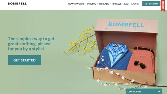
Simple, simple, simple is the message here. The attract bright colours encourage the user to click further into the site and it can be presumed that these all change with the season ensuring their pipeline is always full. Good work!
5. Over
For a lot of modern businesses an app is the key to their company. Whether this be to increase interaction with users via mobile devices or - increasingly - the app is the bases for the company itself.
The mobile application Over which is the self-defined 'easy app for creativity & design' offers a great example of this with their interactive landing page. Clicking on the CTA plays a short and sweet video briefly showing a user exactly how the application works.
Showing your users examples of exactly their content will look if they use your product is a brilliant way of increasing engagement and ensuring your potential users go the whole-hog and download or use your service. Engagement must be done as quickly and simply as possibly.You can bamboozle them later on with with finite detail as to EVERYTHING your product does, but initially just focus on the basics.
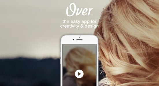
A simple, obvious play button is the only thing of note on this page but it just works. So much so that I have downloaded the app myself upon researching for this blog. If nothing says that doesn't scream 'brilliant landing page' I don't know what does!
Conclusions
The brief of a landing page is simply to get people moving into your site, clicking on more content and engaging with your product or service.
Try doing this a simply, cleanly and quickly as you can and you'll be on to a winner!
More from Website Conversions

12 (& a half), of the Best Contact Pages That Retain More Customers!
Conversations and making connections with visitors is often the very least a website should do. Getting people onto your site...
10 Actionable Tips to Improve your On-Page e-Commerce SEO Today!
Boosting the traffic, in particular, relevant traffic to your site is important no matter which business plan you are pursuing....


