


Conversations and making connections with visitors is often the very least a website should do. Getting people onto your site is tricky enough and something that we cover in our SEO series, but the holy grail of a site should be cool, simple CTAs that funnel your users to exactly where you'd like them and essentially help you to retain more customers.
And guess what? This is harder than it would first appears (shock-horror).
Ensuring you retain potential customers long enough to perform an action is tricky enough but getting them to fill out a form or pick up the phone is another kettle of fish...
So what makes a great, customer-retaining contact page? Well to get us (you!) started we have trawled the web in search of such pages to produce this...enjoy!
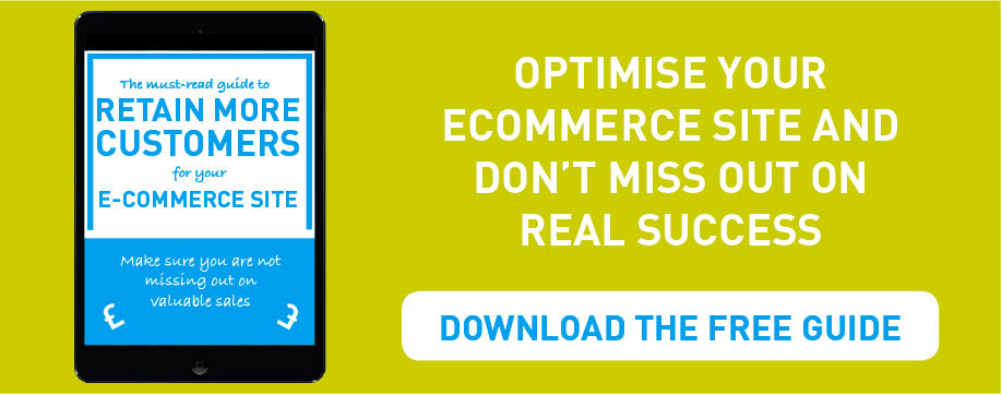
Want to retain more customers for your ecommerce website? Read our full guide to discover how to.
1. NOEARAUJO.com (be simple)
Who needs huge clever graphics when you can simply have effective and minimalistic content which does exactly what is required. NOEARAUJO doesn't mess around and their stripped back contact page looks and feels brilliant.
I can't get enough of this one.

2. MostlySerious.io (be engaging)
Engaging your potential clients and customers is naturally crucial, and giving them a contact form that requires them to engage but not be over complicated is a tricky egg to crack (is that a phrase...it is now).
US marketing firm Mostly Serious have managed to capture the space in between complication and interesting. Using cheeky questions and witt, you don't have much of a choice but to at least fill out this form.

3. Dubsat.com (ask a question)
As above, getting engagement with any potential customers is crucial and nothing is better at doing this than a direct, simple question. Repeated over different topics you have very effectively created a mini (albeit one-sided) conversation.
Dubsat do this brilliantly with colourful and inventive contact form with questions which range from 'How can we help?' to, 'Where abouts you from?'. Clever stuff.

4. Codequest.com (be casual)
Now obviously this won't always work and depends on the sector and client you deal with and are looking to attract. But if appropriate tongue-in-cheek pages and CTAs will always get a smile out of your users and hopefully get them to complete an action.
Codequest have utilised this here with a wonderfully designed page which asks whether users would like to "come in for a coffee?".

5. BuiltByBuffalo.com (provide options)
Believe it or not, most of your customers will be uniquely different (shocking I know). And as such are going to have differing views, needs and of course want to contact you in different places.
Where as most of generation X will want to pick up the phone to speak to a 'real person', Y and Millennials may either prefer to email you or even DM using social media. Providing your users options therefore can improve your chances of getting them to contact you.

6. ProductionLocations.com (specify)
If like ProductionLocations you work across various sectors or departments then your contact pages must ensure that each user's information is picked up by the correct party.
It is time-wasting and unproductive to send User A's enquiry to Staff Member D when Staff Member A could have responded and got a conversation going. Therefore, make sure users can easily get across to you what they need from your company. This is acheived expertly by ProductionLocations.

7. PayPal-business.com (tailor-made)
Each of your customers is important. Even those who don't know they are your customers yet...
You tailor your service and communication to each individual you deal with, and your contact forms should be know different.
PayPal Business ensure that this is done by a mutli-layed form which guides users through to exactly what they are looking for via a number of simple two-choice questions. This will engage users as well as ensuring they get exactly what they need.

8. Vismaad.in (stand out)
Going against the grain and looking different is normally for the best in any industry. Taking this approach and applying it across your site is bold and exciting step to take.
Vismaad do this with the simplest of features on the smallest of pages. By having a completely different looking Google-map or location based solution, this page, site and company ensure that you take a second look at them before moving on.

9. SethGodin.com (be to the point)
Don't waffle. You try not when talking and you don't do it whilst emailing clients. Your contact page's shouldn't either.
What do your customers want? What can you provide for them if they contact you?
Those should be the only questions that need answering on any contact page and Seth Godin doesn't mess around with this literal interpartation of this request. The humour here really makes this page stand out and will entice users to get in touch.

10. CleverBirds.com (be friendly)
A few nice words can go a long way and this is beautifully executed by CleverBirds with their friendly contact page.
Utilising copy in order to encourage your users to get in touch is important for engagement but the fact that CleverBirds do this in so few words is impressive and a testament to the power of friendly-on-point copy. CleverThings... (oh, come on that was always coming!)

11. PixelWrapped.com (be inspiring)
Your contact page could be the last chance you have with your user to influence and convince them that you are the company that they should be investing in and thus contacting.
Using cool animation and a simple idea, PixelWrapped have made good use of a type-writer to put a smile on the face of users. The idea of engaging your user at all stages of a site's experience is crucial to inspiring and delighting your users.

12. UltraNoir.com (be beautiful)
Making your pages attractive to look at, and interact with, is fundamental to ensuring your forms are filled out and ultimately fulfil their purpose.
3D design agency, Ultranoir grab this with both hands with their attractive and clutter-free page. An attractive form with minimal distractions means this page will successfully perform its duty.

12.5 Mix it up!
So I know its been killing you to find out what the '& a half' was: well simply it is, Mix it up!
Mix up the phrasing and CTA's that you put on your contact page.
Contact Us - let's be honest - is dull as hell. Come up with something witty, cheeky, serious, motivating or enticing to get your users and potential customers to click that button and submit a query to your company.
Even if you can't come up with some clever animation or killer copy, using a clever one liner will get people to submit a form and increase your success rate no end! Try it, here are some of our favourites:
- Get in touch
- Drop us a line
- Let's chat
- Let's get started
- Send it!
- Make contact...
- Launch my campaign
- Start your journey
More from Website Conversions

How to Improve The SEO For Your e-Commerce Product Pages
As with most things, SEO for e-Commerce is actually much harder than is immediately apparent. Although you may think having the...The NHS Go Genbutsu: How the Civil Service is Thinking Lean
As part of the government’s response to the recent problems at the Mid Staffordshire NHS Trust, the health secretary, Jeremy...