


As with football teams and music, the digital team at Purple Frog has its favourites when it comes to e-Commerce websites and some, naturally, are better than others (Man Utd over Tottenham and Swindon for example).
Now although we have touched on this before in previous blogs - 5 of our favourite landing pages and 7 of the best mobile website designs to name but two - we haven't compiled a list taking into account the whole package and certainly not specifically e-Commerce.
For companies that rely on e-Commerce for business, a website is the most important asset in their arsenal. Nailing it can mean the difference between future investment in staff, infrastructure and growth or, going home empty handed.
To quote the website awards company - Awwwards - e-Commerce sites are "the first interface between the customers and the seller, your visit card, your best assistant, in short, the perceived image of your company."
So now for the it. What is it?
Simple put, we call it a site that has everything. Great UX, clean, beautiful design, great e-commerce SEO, amazing user journey's and finally that awesome simplicity which cuts through everything else to deliver the exactly what the user needs.
So information-seeking-people of the internet, here - freshly package - are 5 Examples of Great e-Commerce websites that have nailed it.
Are you struggling to understand your SEO? Check out our FREE tool to find out how you're getting on!
1. Cover-Up.com
Now this is a personal favourite of mine as I actually have one of their very own Woodback iPhone cases after they appeared as a sponsored post on Instagram. The slick natural tone of their company and outlook have been carried through onto the website.
The simple, blocky nature of the home page allows for sliding photos that remain both up-to-date and eye catching whilst ensuring pages do not become cluttered. The CTA (calls-to-action) are clear without being in-your-face and the general usability is one of great simplicity.

Although not perfect for every occasion, mega menus provide a great platform from which to introduce one-click navigation to a site. This can be fantastically deployed by e-Commerce sites if introduced correctly, allowing for simple user journeys and directing traffic to thoughout the rest of the site from any page.

You can see from the screen-grab how quickly users would be directed to the other product categories and even product page. Goodbye to fiddly and inconsistent search features of old! They've even managed to nail their SEO with clean text accompanying each product page.
Although more white space could have improved the view (even perfection can be improved upon) the use of customer reviews only strengths this great e-Commerce site.
2. NiteWatches.co.uk
This is just a cool site plain and simple. Here we have a classic example of sticking to your product brief and placing it at the heart of everything you do and design.
As their name suggests, niteWatches design and make timepieces that work exceptionally well in the dark and - because that's when it's normally darkest - the night.

With brilliant conviction this site delivers on the promise and the dimmed lighting gives an excellent - and entirely convincing - impression that the user is seeing the watches in action. This is a cracking display of thinking outside the box when it comes to web design especially in an environment where white space is usually championed.
Although the user journey could be straighten out - *ahem* mega menu *ahem* - the overall experience is fully immersive and thoroughly impressive. The site's functionality steps towards the epic with users able to directly compare watches against one-another in addition to being able to switch between a 'Night/ Day Mode'.
This functionality alone grants this site a place on this list.
3. Greats.com
This trainer (sorry, sneaker) company have placed a slightly different spin on the classic e-Commerce site. Going for relaxed vibe, Brooklyn based, shoe brand GREATS have customised their website to suit their unique style.
GREATS use of the mega menu is where this site begins. Opting for symbols and outlines rather than text really enhances the users experience and allows users to understand what the shoe will look like without large (memory sapping) images which would slow the page load times.
Once on the product pages themselves, on-page SEO is nailed immediately with great content which provides genuinely useful information for potential customers. Look advice, product details and product description are wonderfully optimised with images to give an immersive feel to this sneaker company's portfolio.

From the above screen-grab we can see the clearly defined CTAs and easily accessible mega menu which quickly funnels traffic around the site.
4. DropDead.co
Now, not every site needs a mega menu and there are certainly fantastic solutions out there which cater for this need. Edgy American clothes company DROPDEAD use - to great effect - sticky side bars as their key navigation tool.
This works brilliant and the site actually feel a lot like a Tumblr page rather than an e-Commerce site. Long lists of scroll-able images ensures not only is this site is optimised for mobile devices, but allows 'Add to Basket' and the rest of the site are merely one-click away. Using sticky sidebars is a brilliant solution to cater exactly for target market: young people who are familiar with the time-line structure of all modern social media platforms.

There is no attempt to reinvent the wheel here. DROPDEAD have understood completely what works so well with social media layouts and copied it to-a-t. Simplicity is key here with no clutter surrounding the product and SEO satisfied with some cleverly designed and beautifully written editorials.
DROPDEAD have realised that most of their traffic will likely come from social media so provide good links through their website. This site grows on us the more we see it.
A really clever solution to a problem that usually goes down the mega menu route. Great work!
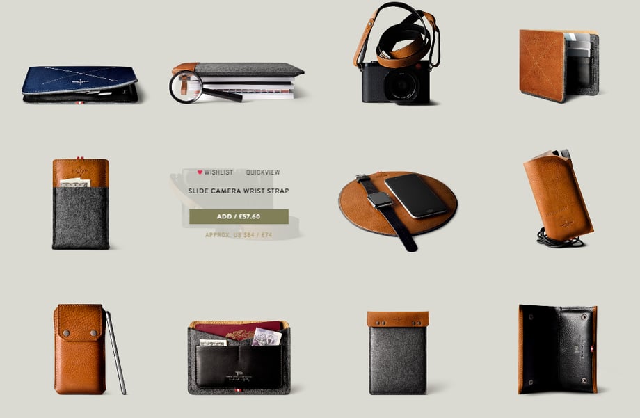
5. Hardgraft.com
The best till last (obviously!). Used as the hero image for this blog, this fashion - and generally cool stuff brand - nails everything about e-Commerce sites.
Completely thinking outside the box, HARDGRAFT - a leather goods designer - put simplicity at the heart of this entire project. Perfectly optimised for mobiles with hidden swipe menus, which still work exceptionally on desktop, mean that navigation is as simple as if this were a mobile app.
The lack of text again is solved by a blog area but the focus of this site is user experience and pleasure. Epic category pages have nothing on apart from images and when users hover over specific products, ONLY key information appears. The use of roll-over here is great.

High-res images work well with the entire vibe of the site, meaning users are welcomed by gloriously clear photos. As above the hidden menus mean baskets and the rest of the site are just one-click away throughout the visit.

Once taken through to a product page, the brilliance continues. Easily accessibly social button and images can be scrolled (again perfectly optimised for mobile) to view previous customers' purchases. This is a classic example of, 'nail your website so you have no need for an app'.
And HARDGRAFT have put plenty of hard-graft (sorry!) into this site.
Conclusion
The headline here is simply does it. Target your audience and ensure you tick all the boxes in terms of design, usability, user journey and SEO. Delighting your audience and users will go a long way in making them come back and getting them to ultimately purchase something from your site.
Thinking outside the box has helped all the above websites propel themselves onto this list of great e-Commerce websites. Creating something that acts, feel or is completely different and you'll be on to a winner.
But the real question is, is your e-Commerce website nailing it?

More from Website Visibility

How to Improve The SEO For Your e-Commerce Product Pages
As with most things, SEO for e-Commerce is actually much harder than is immediately apparent. Although you may think having the...
What does Instagram Stories mean for Snapchat and Digital Marketing?
"If you can't beat them. Clone them!" "If you can’t innovate, imitate." Even taken with a pinch of salt, these represent a...