White Paper Design: 7 Tips on How to Do It Right


Creating a strong whitepaper is a crucial part of inbound marketing (click here if you want to know more on what inbound marketing is >).
According to Artversion, white papers are one of the most effective tools in the B2B world, and that is because they are great for educating potential customers about a certain topic you provide the solution for.
But once you have put in all the effort in writing remarkable content for your white paper, why should you now bother about the design?
Bottom line is, if you don't create a good design around your white paper, no one will download it! A good design will create more engagement and excitement around your white paper and it will help you communicate the message more effectively, and therefore it's very important to get it right.
The following tips can be used for optimal white paper design to really make it stand out.
1. Choose the right software
The top software for creating a white paper is certainly InDesign. InDesign is perfect when you have a lot of content, as it helps you streamline the design between the pages by using the same guidelines (same margins, gutter, baseline, etc.). It ultimately makes the white paper or the PDF look more professional and the consistent design elements also make your document easier to read.
However, not everyone has the skills (or the money) to use InDesign, so other programs you could use are Word or Power Point. We would suggest using the former if you have quite a lot of text, because, similarly to inDesign, it helps you streamline the styles, the margins, etc. On the other hand, Power Point is better if you have quite a lot of images, such as graphs and / or pictures, as it gives you more flexibility with the positioning of the imagery and the text on the page.
2. Make the title stand out
You don't need to create a fully illustrated cover, but what you do want to do is make your title stand out. You have probably spent quite some time to make sure your title is very catchy and interesting, so now you should dedicate your whole first page to it (and to the subtitle, if you have one). Make sure it's very big, bold and colourful, so that it will surely attract the attention.
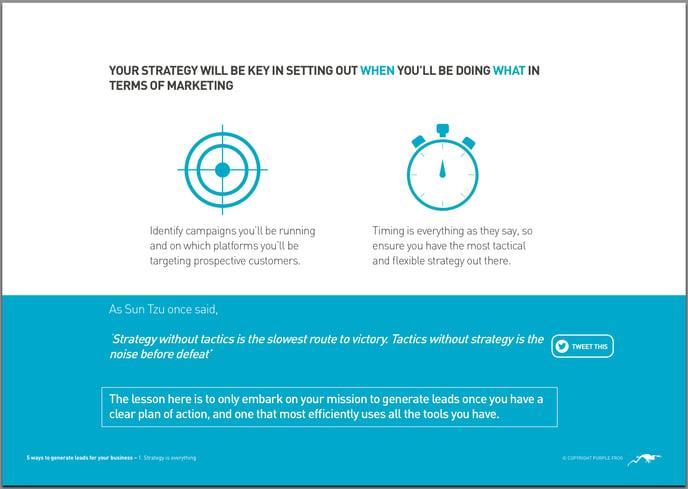
You can see below the cover of one of our white papers on the 5 ways to generate leads for your business. We decided to go for the bright green colour of our brand, which works perfectly in making the title really stand out, and the font of the text is very bold. It immediately captures the attention of the readers to the text, and not distract them from what the topic of the white paper is.

3. Use images wisely
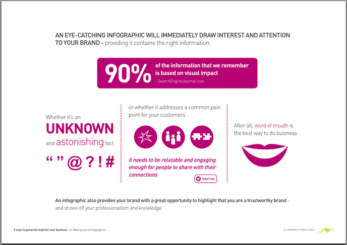
Images are very important for breaking up the text and making the content more interesting.
Graphs are something you should definitely consider using in your white paper, as they are more captivating than words and they help explaining complicated things in an easier way or showing data that might otherwise seem boring.
Symbols and colour boxes also help you illustrate your points better and lead the readers' attention to the key parts of the text.

On the other hand, though, make sure you only use them when they are actually relevant. Don't panic and get any image that pops up on Google just to have an image in there, as it won't add anything to the text and it will actually get in the way of the message you are trying to convey.
4. Find your own identity
You can find all sorts of ready-made templates online for white papers, but truth is that if you just follow a standard design that probably dozens of other businesses are using, your white paper will certainly not stand out. It also won't help with creating your own identity and brand.
Make sure you spend some time choosing the right typefaces and colours you want to use. These will have an enormous impact on the way your white paper will look. There are some online tools that can help you with creating your own colour palettes, such as Coolors or Adobe color CC. They can be great starting points to help you individuate a colour scheme that will work for your company and your specific white paper.
5. Put the right amount of information in each page
We are going to reveal to you a secret, which is the key of how we design our white papers and PDFs. We have a simple 3-steps way to plan how much content to put in each page and how to design it:
- Read your paragraph
- Individuate the key sentence
- Make that key sentence the focal point and give it its own space
Seems quite easy, but it does help a lot with designing your pages. Once you have your key sentence, you can really make it stand out and dedicate the whole page to that one concept, with the right images to complement it, and then move to the next one in the following page.

6. Make it simple to find out more about you
At the end of each white paper, always include a link that leads to one of your landing pages, where readers can find out a bit more about you.
You should always start from the assumption that people are lazy. Unless they are extremely keen to know more about you, they won't go through the effort of opening up their browser, going onto Google, typing in your name, clicking on your website, and searching for the information they need. Therefore, embedding a link directly into your white paper that takes readers to a well constructed landing page that contains everything they need to know about you is very important.
7. Add elements of interactivity
If you want to really take your white paper or PDF to the next level, then you should consider adding elements of interactivity.
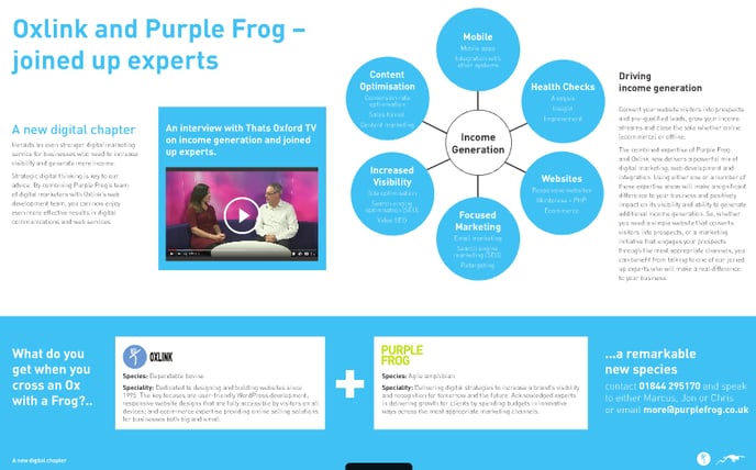
We use a special software to design interactive PDFs and white papers for our clients and our own marketing material, which is called 3dIssue. You can have a look at an interactive PDF we created here, where you can see we've incorporated in it videos and image galleries to really make the PDF come alive.

You can also add some small elements of interactivity directly inside the software you are using to create your PDF, such as adding a 'Tweet This' button that allows readers to share pre-written tweets around certain sentences. Social Media Examiner has a very useful guide that explains to you how to do this in a set of very easy steps.
"Tweet This" buttons are great as they follow the same principle from the previous point about assuming that people are lazy. In just 2 clicks someone can share something they liked and spread the word about your content. It's all extra promotion for your white paper!
Conclusions
There are different ways in which you can make your PDF stand out, such as really thinking about how you are going to design your pages, how to grab people's attention and adding elements of interactivity. In the end, however, it all comes down to one concept: every single marketing material you produce, has to really reflect your brand and the image you want to portray to customers and/or potential customers. Only in this way you will be able to create something truly remarkable and make your company stand out from the competition.
Do you have any issues with designing your white papers? Or do you have a straight-forward method you use each time?
More from Creative Marketing

What Marketing and Sales Can Learn From The State of Inbound 2016 [FREE REPORT]
Find out what's next in the world of sales and marketing and make sure you are meeting your potential buyers' needs! The State...
Hiring an Agency Vs. DIY Inbound Marketing
"Why hire an agency when inbound seems straight-forward enough to do on your own?" is the question running through the minds of...


