


In marketing, data is everywhere. Every move you make is determined (or at least should be!) by data you have managed to get your hands on and analyse. You might draw incomplete or incorrect conclusions by analysing the wrong bit of data, but all in all, there's no end to the supply of data you can interrogate. Plus, there are an abundance of free tools out there that allow you to have an in-depth look at your website and visitors.
However, in all that data, sometimes the answer isn't where you expect it to be, or even there at all. The absence of data can be incredibly useful and although it takes time and discipline and an ability to think outside the box, examining the absence of data might be what leads you to a successful website.

"Survivorship bias, survival bias or immortal time bias is the logical error of concentrating on the people or things that made it past some selection process and overlooking those that did not, typically because of their lack of visibility. This can lead to incorrect conclusions." - Wiki
It is often the result of humans putting too much trust in the first bit of information they see and ignore the rest.
During World War II, fighter planes would come back from battle with bullet holes. The Allies found the areas that were most commonly hit by enemy fire and sought to strengthen the most damaged parts of the planes to reduce the number that was shot down.
A mathematician called Abraham Wald, pointed out that perhaps the reason certain areas of the planes weren't covered in bullet holes was that planes that were shot in those areas did not return and they were actually dealing with “survivorship bias”.
This little idea led to the armour being re-enforced on the parts of the plane where there were no bullet holes.
The story behind the data is arguably more important than the data itself. Or more precisely, the reason behind why we are missing certain pieces of data may be more meaningful than the data we have.
Survivorship Bias in User Journey's
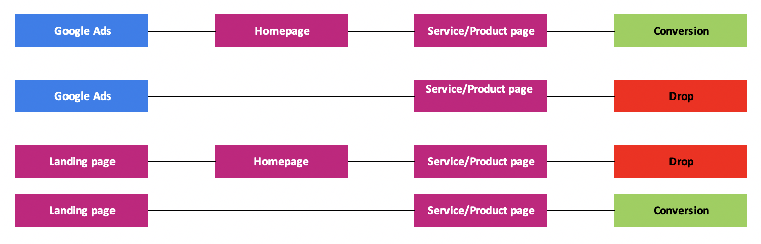
The above graphic illustrates two entry points into the website; Google ads and a landing page. It shows the journey a visitor might take to go through a website to either conversion or drop represented by navigation to either Homepage or Service/Product page. Cognitive or “Anchoring” bias could indicate to the marketer that Google Ads is a better entry point than the landing page, if Google Ads conversion rate is 8% for example, as opposed to the landing pages 4%. That might be the correct conclusion, but it’s supported by an incomplete analysis. If you look at the graphic, you’ll notice that the top Google ads entry, requires an extra step to conversion versus the Landing page example, which does not. You’ll notice that if the user enters through the landing page and land on the homepage, they drop off. This would indicate that the users from Google Ads need a bit more validation before they’ll make the commitment to purchase a service or product and become a conversion. If that extra information isn’t provided, they don’t convert. The visitor who entered through the landing page could represent could be a user who is further down in the marketing funnel than a visitor who is entering through Google Ads. Too much content and information for this visitor could lead to a drop because they get “stuck” - which is normal for users who are lower in the funnel.
It’s important at this point not to conclude that Google Ads are performing better as an entry point than the landing page, but that the visitor might be a completely different persona.
Conversion rates are an excellent example of survivorship bias in digital marketing. When analysing and evaluating successful conversion paths, it’s easy to forget to consider the larger audience who didn’t quite make it to conversion. Obviously this isn’t to say that you shouldn’t consider everything that is working, but it's imperative to look at the things that aren't working as understand why, because it might indicate more than meets the eye. Drop off areas, bounce rates, and other "negative" factors can help to clarify which parts of the user journey needs to be improved.
Survivorship Bias in User Experience
The other scenario we need to consider is what kind of people are visiting your website. There are those who have fought their way through the bad UX and yet still return to your website. There are also those who get in touch as soon as they come across something on your website that they're not happy with. The survivors are those who complain.
But what about the other website visitors? The one's who don't complain and just trudge through your site in the vain hope they'll make it to their desired goal? People who create tickets are a minority, but you might have many potential customers who struggle to find the information they need.
It's easy then, for the business to take the tickets and resolve them. But that shouldn't be the end of the story; you need to consider the things the visitors aren't complaining about.
Consider those who stopped using your website because they didn't like how something worked, they couldn't find the information they needed or didn't have time to give feedback on the site. Approach User Experience with a bit of paranoia. Look for the bullet holes you don't see.
How Can You Find the Marketing Bullet Holes?
Bounce Rates
We briefly looked at bounce rates in the user journey graphic. Looking at the numbers, you might think it's great that your bounce rate is only 41.1% (average bounce rate), but looking at the bounce rate of singular pages isn't the full picture. If your website visitors give up and leave after a few clicks, there is an issue that needs to be looked at.
HeatMaps
HeatMaps such as HotJar allow you to "Understand how users behave on your site, what they need, and how they feel, fast.". What we find is that when looking at HeatMaps, the website owner will move the product or service that is receiving the most clicks to centre stage. But you should also be considering what doesn't get clicked.
Where do they go?
After someone has visited your website, where do they go? Difficult question to answer, but by utilising a tool like, Google Tag Manager and linking it to your Google Analytics, you can track "events" which can show you where your visitor is going*. Obviously the issue here is that you can't tell whose site they visit without clicking on the link.
Conclusion
When looking at your website data, it’s easy to only concentrate on the data that is readily available. But by completing a more thorough analysis of your traffic by examining faults in the process, you’ll uncover so much more about your website visitors and how to cater to their needs. Bear in mind that the data won’t give you the answer to why people drop off, but the analysis of the data married with your insight into your company will help form those answers.
More from User Experience

Pinterest For Business: 6 Steps to Success
What is Pinterest? In a previous blog post we discussed it as being a good platform but it does take maintenance. It works by...
Marketing Automation Software: HubSpot VS SharpSpring
Marketing automation tools are must-haves for any business looking to expand in the 21st century, and that's because: They are...